提升obsidian minimal theme标题的可读性
Obsidian minimal theme什么都好,只是h3标题和正文看起来完全没区别,影响使用体验。
此外我很喜欢typora的newsprint主题,已经把这个主题修改成适配不同工具的样式文件(此处应有链接)把它带进千家万户[1]。
因此,在建立这个博客的时候,我顺便把下面的snippet放进了custom style里:
body {
  --font-interface: "PT Serif", 'Times New Roman', Times, serif;
  --font-text: "PT Serif", 'Times New Roman', Times, serif;
  --h1-size: 1.875em;
  --h2-size: 1.3125em;
  --h3-size: 1.3125em;
  --h4-size: 1.125em;
  --h5-size: 1em;
  --h6-size: 1em;
  --h1-style: normal;
  --h3-style: normal;
  --h1-line-height: 1.3em;
  --h2-line-height: 1.15em;
  --h3-line-height: 1.15em;
}
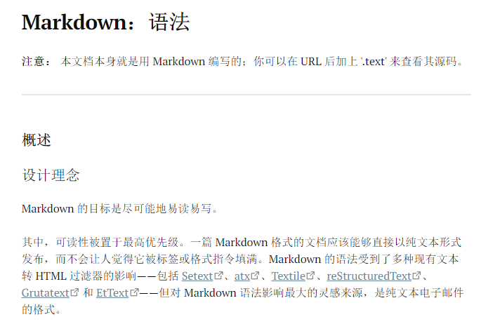
效果:
从2021年起我已经致力于此事,到现在热情如故,所以我已经有资格下此断言了:我真的很爱newsprint。 ↩︎